
Leafwell
Built from zero into the largest virtual care clinic for medical cannabis in the US. Full brand identity, web platform, and mobile app.
The problem
Leafwell had nothing. No brand, no product, no market position. Just a bet that cannabis needed to be treated as medicine.
Outcomes
1M
500,000+
800+
My role
Made at duall®studio
Lead Product Designer , brand identity, UX strategy, flow definition, and UI across web and app, with direct ownership of design decisions
Scope
Brand identity · Design system · Marketing website · Mobile app · Content platform
Methods
User interviews and A/B test results fed directly into design decisions throughout
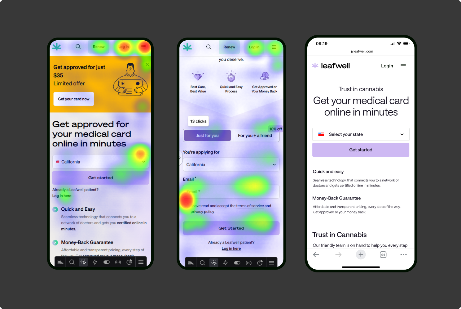
Brand
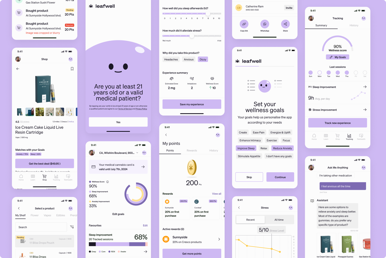
When the project started, the medical cannabis space online was visually dominated by what the category had always looked like. Leaf icons, greens, an aesthetic built for recreational users, not patients.
The founding insight was that Leafwell wasn't competing with other cannabis brands, it was competing with how seriously people would take cannabis as medicine.
The company's ambition was to become the trusted source of truth for medical cannabis: clinically credible enough for a 50-year-old patient with chronic pain, not just appealing to a 20-year-old recreational user.
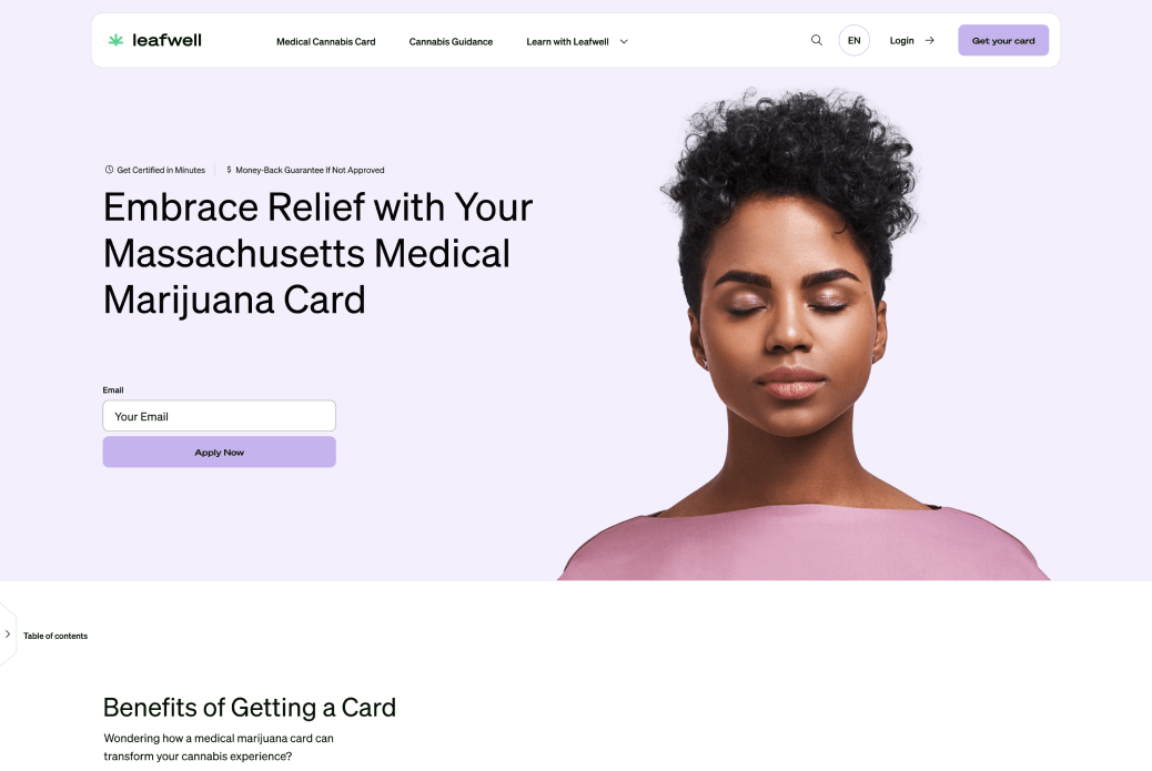
Defining a new visual language for medical cannabis
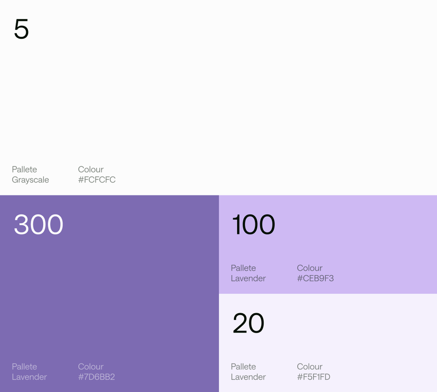
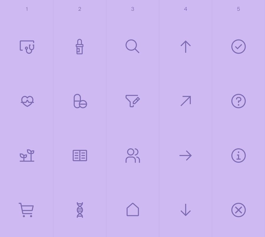
Every cannabis brand at the time used greens and leaf iconography aimed at recreational users. We made a deliberate break: a palette built around purple and clinical, trustworthy tones, closer to a healthcare or wellness brand than a dispensary. The goal was for a first-time, anxious, possibly older patient to feel like they were entering a doctor's office, not a cannabis shop
Key decisions
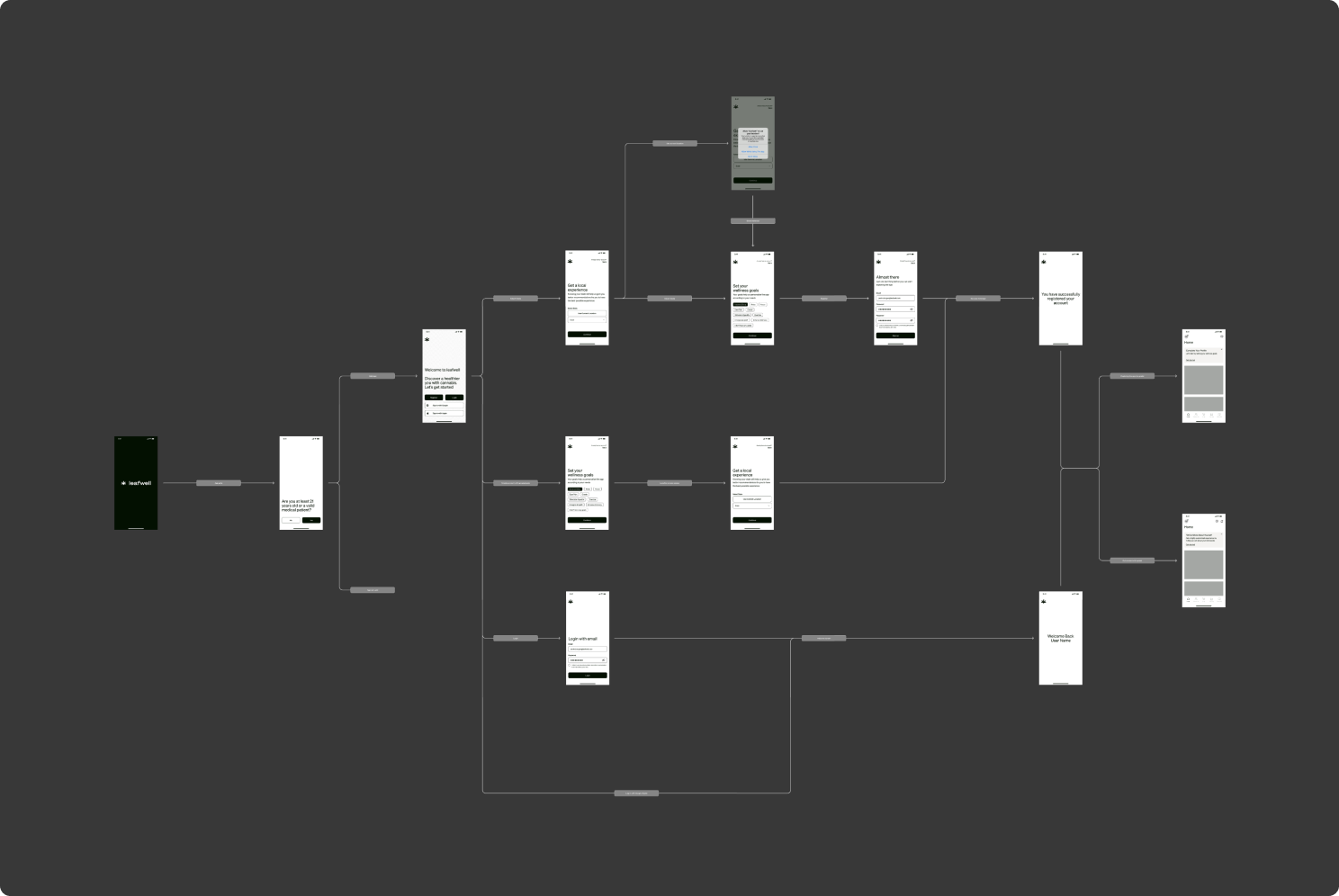
Designing the first-time flow as the product's most important moment
With users ranging widely in age but skewing 30+, many engaging with cannabis as medicine for the first time, the certification flow couldn't feel transactional or intimidating. We prioritised this experience above all else early on, clear steps, reassuring language, and a process that felt closer to a telehealth appointment than an online purchase.
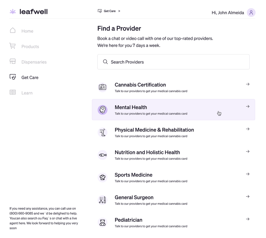
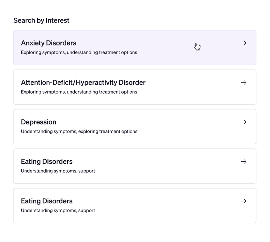
Cannabis certification was Leafwell's core product, but "Get Care" was architected as a general booking system
Mental Health, Nutrition, Sports Medicine, and more all live on the same flow. Building it this way meant every future specialty could launch without a new booking pattern.
Building retention through utility, not just content and meet the users needs.
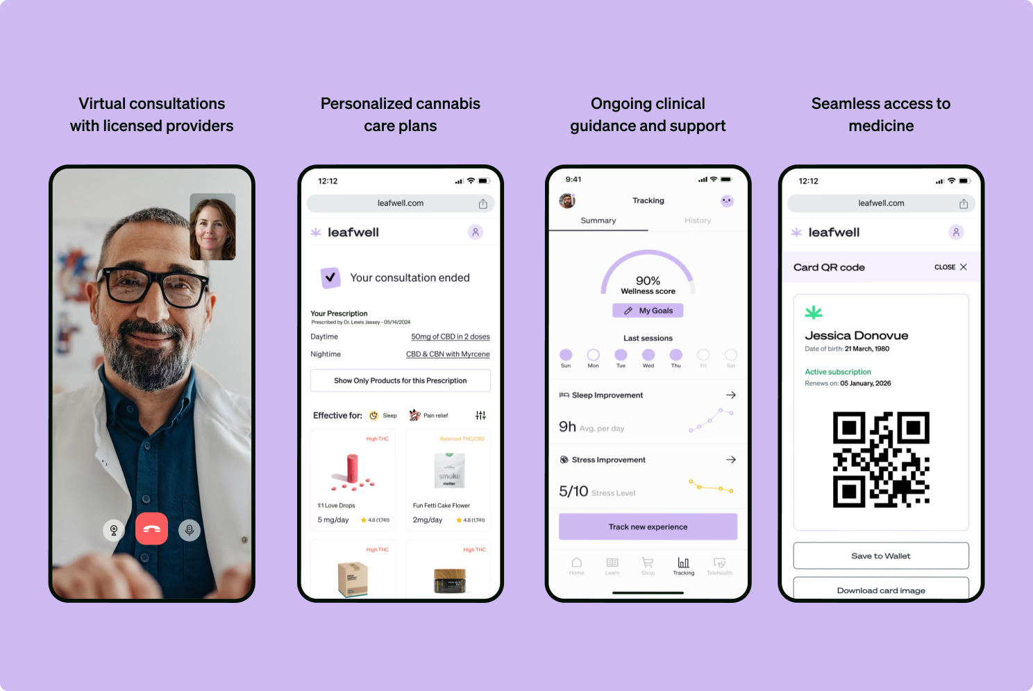
Once a consultation ends, the prescription, dosage, daytime/nighttime regimen is given to the patient but rather than a generic storefront, products are filtered by "Effective for" tags (Sleep, Pain relief) tied to the patient's own prescription, with a one-tap filter to show only prescription-matched items.
A medical card, once obtained, doesn't need to be renewed for months, so the app needed reasons to stay relevant in between.
We designed two systems for this: a partner store marketplace giving users in-app access to dispensary discounts, functioning closer to a delivery marketplace than a static directory, and a points-based loyalty system modelled on engagement mechanics, rewarding return visits and purchases rather than relying on the medical card alone to bring people back.
What I'd do differently
The website work was eventually handed off and changed direction after duall involvement ended
The change of direction was made not just from a visual standpoint but there were also structural changes with no metrics that supported them, a reminder that design systems and decisions only hold if there's ownership to protect them after launch. I would manly liked to have created more documentation for a better handoff that was tied with the results we had.