
Plen Advogados
Corporate and M&A law firm founded in 2007, ranked by Chambers & Partners. Serving international clients from Lisbon's Amoreiras Tower.
The problem
A Chambers-ranked law firm with a website that looked and felt like it was built in 2000.
My role
Made at duall®studio
Lead and sole UX/UI Designer, working directly with the client throughout
Scope
Full website redesign · IA restructure · Brand application · Motion design (Barba.js)
Methods
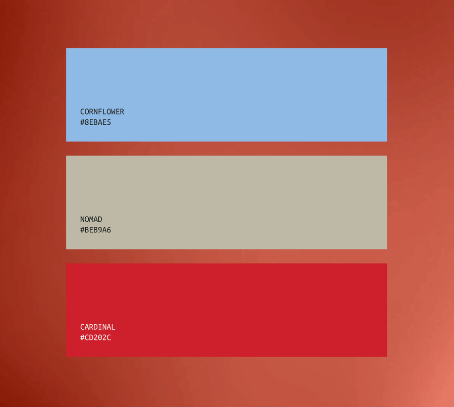
Brand identity by Alfred Agency — we applied and extended it across the full digital experience
Analysis
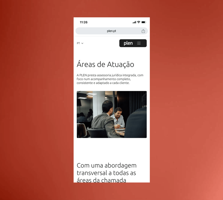
The existing website had 15 pages — but they were fragmented, thin, and structurally confused.
The team was split across three separate pages (partners, associates, trainees), each too short to rank or inform. Practice area pages were isolated silos with barely enough content to justify existing. There was no narrative, no reason to keep reading, and no path guiding the user anywhere.
Key decisions
Design the tension between authority and approachability, not one or the other
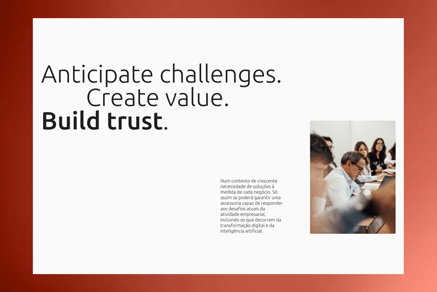
Most law firm websites resolve this tension by picking a side: either cold and institutional, or warm and startup-like. Both felt wrong for Plen. Their partners are senior, internationally recognised, and serious, but their philosophy is explicitly that of the lawyer-consultant, accessible and business-oriented. The design had to hold both at once.
We achieved this through editorial layouts with generous white space that signal confidence without coldness, high-quality photography that humanises the team, and language that is clear without being casual. The reference was closer to a premium financial services brand than a traditional law firm.
Make the team the centrepiece, not a footnote
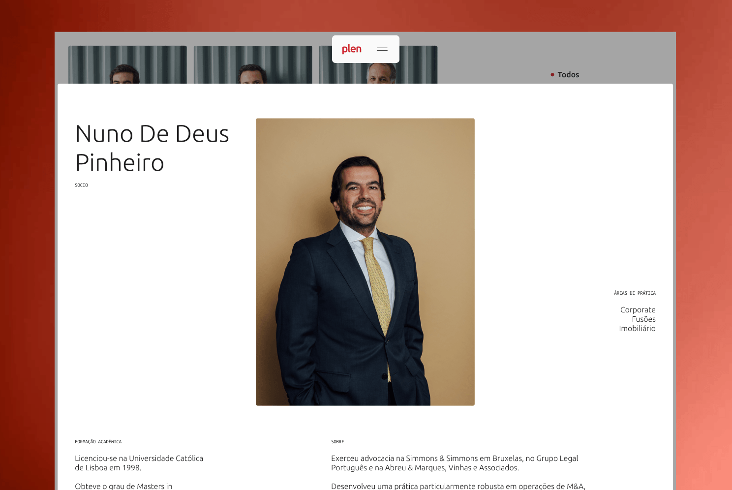
In the previous site, the team was fragmented across three separate pages. Partners, associates, trainees, each shallow and hard to navigate. The people are Plen's most credible asset: Chambers-ranked, decades of experience, recognised names in Portuguese corporate law. We consolidated the team into a single, richly designed experience, with individual member pages that function almost like editorial profiles, premium photography, detailed bios, areas of expertise, notable work. For an international client evaluating whether to engage a Portuguese law firm, this is the page that makes the decision.
Use motion to signal craft, not decoration
We implemented seamless page transitions using Barba.js, something essentially absent from the Portuguese legal sector online. The decision wasn't aesthetic. In a sector where every competitor's website feels static and dated, smooth transitions communicate modernity and intentionality without a single word of copy. A client visiting three law firm websites in a row will feel the difference immediately, even if they can't articulate why. The experience itself becomes part of the trust signal.